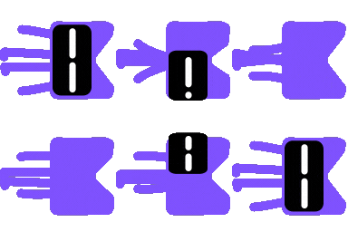
Bottom tab bar featuring a deforming liquid-drop indicator that charges on press-and-hold, carries springy momentum between tabs, bounces on arrival, includes haptics, shadowing and theming.
A Compose Multiplatform bottom tab bar with a liquid, "drop of fluid" indicator instead of a static highlight. The active indicator glides between tabs, deforms based on travel speed and direction, reaches toward a tab while press-and-held, and bounces on arrival — with matching haptic feedback.
Built for FreeFootball / PlayWithMe and extracted here as a standalone, themable component with no dependency on that app.
Path (two arcs + a tangent-matched cubic
connector), not a scaled rectangle. The side reaching toward the destination swells bigger; the
side left behind thins out and sags, like liquid draining from where it used to be.Kotlin Multiplatform + Compose Multiplatform: Android and iOS (iosArm64,
iosSimulatorArm64). On iOS this ships as a Kotlin/Native framework — it only works inside an app
that embeds the Compose Multiplatform runtime (e.g. via ComposeUIViewController in a Swift app,
or a full Compose Multiplatform iOS app); there is no pure-SwiftUI/UIKit version.
Not yet published to a public repository. For now, publish it to your local Maven cache and consume it from there:
./gradlew :fluidbar:publishToMavenLocalThen, in the consuming project's settings.gradle.kts, make sure mavenLocal() is one of the
resolution repositories:
dependencyResolutionManagement {
    repositories {
        google()
        mavenCentral()
        mavenLocal()
    }
}
And add the dependency to your Compose Multiplatform module's commonMain source set:
commonMain.dependencies {
    implementation("com.github.kiolk:fluidbar:0.1.0")
}FluidBar is generic over your own tab item type — it has no built-in notion of what a "tab" is,
just a list of items, a selected one, and two functions to read an icon and a label from each item.
enum class AppTab(val icon: String, val label: String) {
    Home(icon = "🏠", label = "HOME"),
    Search(icon = "🔍", label = "SEARCH"),
    Profile(icon = "👤", label = "PROFILE"),
}

var selectedTab by remember { mutableStateOf(AppTab.Home) }

FluidBar(
    items = AppTab.entries,
    selectedItem = selectedTab,
    onItemSelected = { selectedTab = it },
    itemIcon = { it.icon },
    itemLabel = { it.label },
)items/itemIcon/itemLabel don't have to come from an enum — any List<T> with a stable
equals/hashCode works (T is used as the key for measuring each tab's position and tracking
press state).
Colors are supplied via FluidBarColors, built with FluidBarDefaults.colors(). Override only the
values you need to change — everything else keeps the built-in defaults:
FluidBar(
    items = AppTab.entries,
    selectedItem = selectedTab,
    onItemSelected = { selectedTab = it },
    itemIcon = { it.icon },
    itemLabel = { it.label },
    colors = FluidBarDefaults.colors(
        activeIndicator = Color(0xFF4CAF50),
        barBackground = Color.White,
    ),
)
Available color slots: barBackground, pillBackground, activeIndicator, activeContent,
inactiveContent, border, shadow.
FluidBar/
  fluidbar/                 the library module (commonMain + android/iOS targets)
    src/commonMain/kotlin/com/github/kiolk/fluidbar/FluidBar.kt
  build.gradle.kts, settings.gradle.kts, gradle/       root Gradle build for this project
Everything lives in one file, FluidBar.kt — the public API (FluidBar, FluidBarColors,
FluidBarDefaults) plus the private path-building and per-item composables it uses internally.
The feel of the motion is controlled by a handful of private constants near the top of
FluidBar.kt — no public API for this today, but worth knowing about if you fork/tune it:
| Constant | Controls |
|---|---|
IndicatorStiffness / IndicatorDampingRatio
|
How fast the indicator travels and how much it overshoots/bounces on arrival |
ChargeDurationMillis / ChargeStretchAmount
|
How long a full press-and-hold charge takes, and how far it reaches |
ChargeDampingBoost / ChargeStiffnessBoost / ChargeLiftPx
|
How much extra bounce/snap/vertical pop a fully-charged release adds |
GrowRadiusBoost / ShrinkRadiusAmount / GrowExtensionPx / ShrinkRecedePx / MaxSagPx
|
The liquid-drop shape itself — how much the leading side swells, the trailing side shrinks/recedes, and how much the connecting curve sags |
ShadowOffsetPx / ShadowBlurPx
|
The drop shadow's offset and blur radius |
TBD.
A Compose Multiplatform bottom tab bar with a liquid, "drop of fluid" indicator instead of a static highlight. The active indicator glides between tabs, deforms based on travel speed and direction, reaches toward a tab while press-and-held, and bounces on arrival — with matching haptic feedback.
Built for FreeFootball / PlayWithMe and extracted here as a standalone, themable component with no dependency on that app.
Path (two arcs + a tangent-matched cubic
connector), not a scaled rectangle. The side reaching toward the destination swells bigger; the
side left behind thins out and sags, like liquid draining from where it used to be.Kotlin Multiplatform + Compose Multiplatform: Android and iOS (iosArm64,
iosSimulatorArm64). On iOS this ships as a Kotlin/Native framework — it only works inside an app
that embeds the Compose Multiplatform runtime (e.g. via ComposeUIViewController in a Swift app,
or a full Compose Multiplatform iOS app); there is no pure-SwiftUI/UIKit version.
Not yet published to a public repository. For now, publish it to your local Maven cache and consume it from there:
./gradlew :fluidbar:publishToMavenLocalThen, in the consuming project's settings.gradle.kts, make sure mavenLocal() is one of the
resolution repositories:
dependencyResolutionManagement {
    repositories {
        google()
        mavenCentral()
        mavenLocal()
    }
}
And add the dependency to your Compose Multiplatform module's commonMain source set:
commonMain.dependencies {
    implementation("com.github.kiolk:fluidbar:0.1.0")
}FluidBar is generic over your own tab item type — it has no built-in notion of what a "tab" is,
just a list of items, a selected one, and two functions to read an icon and a label from each item.
enum class AppTab(val icon: String, val label: String) {
    Home(icon = "🏠", label = "HOME"),
    Search(icon = "🔍", label = "SEARCH"),
    Profile(icon = "👤", label = "PROFILE"),
}

var selectedTab by remember { mutableStateOf(AppTab.Home) }

FluidBar(
    items = AppTab.entries,
    selectedItem = selectedTab,
    onItemSelected = { selectedTab = it },
    itemIcon = { it.icon },
    itemLabel = { it.label },
)items/itemIcon/itemLabel don't have to come from an enum — any List<T> with a stable
equals/hashCode works (T is used as the key for measuring each tab's position and tracking
press state).
Colors are supplied via FluidBarColors, built with FluidBarDefaults.colors(). Override only the
values you need to change — everything else keeps the built-in defaults:
FluidBar(
    items = AppTab.entries,
    selectedItem = selectedTab,
    onItemSelected = { selectedTab = it },
    itemIcon = { it.icon },
    itemLabel = { it.label },
    colors = FluidBarDefaults.colors(
        activeIndicator = Color(0xFF4CAF50),
        barBackground = Color.White,
    ),
)
Available color slots: barBackground, pillBackground, activeIndicator, activeContent,
inactiveContent, border, shadow.
FluidBar/
  fluidbar/                 the library module (commonMain + android/iOS targets)
    src/commonMain/kotlin/com/github/kiolk/fluidbar/FluidBar.kt
  build.gradle.kts, settings.gradle.kts, gradle/       root Gradle build for this project
Everything lives in one file, FluidBar.kt — the public API (FluidBar, FluidBarColors,
FluidBarDefaults) plus the private path-building and per-item composables it uses internally.
The feel of the motion is controlled by a handful of private constants near the top of
FluidBar.kt — no public API for this today, but worth knowing about if you fork/tune it:
| Constant | Controls |
|---|---|
IndicatorStiffness / IndicatorDampingRatio
|
How fast the indicator travels and how much it overshoots/bounces on arrival |
ChargeDurationMillis / ChargeStretchAmount
|
How long a full press-and-hold charge takes, and how far it reaches |
ChargeDampingBoost / ChargeStiffnessBoost / ChargeLiftPx
|
How much extra bounce/snap/vertical pop a fully-charged release adds |
GrowRadiusBoost / ShrinkRadiusAmount / GrowExtensionPx / ShrinkRecedePx / MaxSagPx
|
The liquid-drop shape itself — how much the leading side swells, the trailing side shrinks/recedes, and how much the connecting curve sags |
ShadowOffsetPx / ShadowBlurPx
|
The drop shadow's offset and blur radius |
TBD.