
Small focused responsive-layout toolkit: pick composables and values per screen breakpoint; adaptive navigation (bar/rail/drawer), two‑pane master/detail, conditional slots, testable breakpoint injection, customizable breakpoints.

A small, focused Compose Multiplatform library for responsive layouts — pick the right composable per screen size and let your UI swap shape from phone to tablet to desktop without hand-rolling the plumbing.
Targets: Android · Desktop (JVM) · iOS (iosArm64, iosSimulatorArm64) · Wasm/JS
📚 API docs · auto-published from master
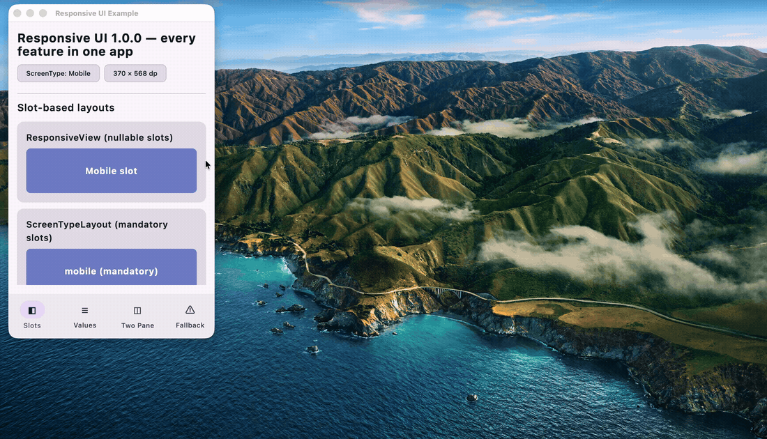
The demo shows the
:exampleapp — resize the window and watchAdaptiveNavigationswap between bottom-bar / rail / drawer while the slots flip through breakpoints. Run it yourself.
| API | What it does |
|---|---|
ResponsiveView |
Slot-based layout — pick a composable for each of Watch / Mobile / Tablet / Desktop |
ScreenTypeLayout |
Same idea, mandatory slots — the compiler enforces full coverage |
responsiveValue<T> |
Pick any value (Dp, Int, String, …) based on the current screen type |
AdaptiveNavigation |
Bottom bar on phones, navigation rail on tablets, persistent drawer on desktop — from one items list |
TwoPaneLayout |
Side-by-side master/detail on tablet+, collapses to a single pane on phone |
ShowOnScreenType |
Conditional rendering by screen-type set |
LocalScreenBreakpoints |
Install custom breakpoints once at the app root |
LocalResponsiveFallback |
Install a branded placeholder for missing slots app-wide |
rememberScreenType / rememberScreenWidth / rememberScreenHeight
|
Live, reactive screen state |
A companion responsive-ui-testing artifact ships setContentWithScreenWidth { }
so breakpoint-sensitive UI tests are deterministic across every platform.
// settings.gradle.kts
dependencyResolutionManagement {
    repositories { mavenCentral() }
}

// build.gradle.kts
kotlin {
    sourceSets.commonMain.dependencies {
        implementation("io.github.nadeemiqbal:responsive-ui:1.0.0")
    }
}dependencies {
implementation("io.github.nadeemiqbal:responsive-ui:1.0.0")
}Gradle's variant resolution picks the right per-target artifact via the published module metadata — no separate Android coordinate.
// Package.swift
dependencies: [
    .package(url: "https://github.com/NadeemIqbal/cmp-ui-libs-responsive", exact: "1.0.0")
]
import ResponsiveUIimport com.nadeem.responsiveui.ResponsiveView
@Composable
fun MyScreen() {
ResponsiveView(
mobile = { MobileLayout() },
tablet = { TabletLayout() },
desktop = { DesktopLayout() },
)
}Slots are nullable — pass only what you need. Null slots render a default
placeholder; replace it app-wide via LocalResponsiveFallback.
val padding = responsiveValue(mobile = 8.dp, tablet = 16.dp, desktop = 24.dp)
val columns = responsiveValue(mobile = 1, tablet = 2, desktop = 4)
Generic over T — works for Dp, Int, String, lambdas, anything.
CompositionLocalProvider(
    LocalScreenBreakpoints provides ScreenBreakpoints(
        watch = 280, mobile = 600, tablet = 900,
    )
) {
    AppContent()  // every responsive composable picks these up
}
Defaults align with Material 3's WindowSizeClass boundaries
(600 dp = Compact↔Medium, 900 dp ≈ Medium↔Expanded).
val items = listOf(
    AdaptiveNavigationItem("Home",     icon = { Icon(Icons.Filled.Home,     null) }),
    AdaptiveNavigationItem("Search",   icon = { Icon(Icons.Filled.Search,   null) }),
    AdaptiveNavigationItem("Settings", icon = { Icon(Icons.Filled.Settings, null) }),
)

var selected by remember { mutableIntStateOf(0) }
AdaptiveNavigation(items, selectedIndex = selected, onItemSelected = { selected = it }) {
    when (selected) {
        0 -> HomeContent()
        1 -> SearchContent()
        else -> SettingsContent()
    }
}| Screen | Chrome |
|---|---|
| Watch / Mobile | bottom NavigationBar
|
| Tablet | left NavigationRail
|
| Desktop | labelled persistent drawer |
var selectedId by remember { mutableStateOf<String?>(null) }
TwoPaneLayout(
    showSecondary = selectedId != null,
    primary   = { ItemList(onSelect = { selectedId = it }) },
    secondary = { ItemDetail(selectedId) },
)secondary when showSecondary == true, primary otherwiseShowOnScreenType(listOf(ScreenType.Tablet, ScreenType.Desktop)) {
SideNavigation() // hidden on Mobile / Watch
}val type = rememberScreenType() // ScreenType.Mobile | Tablet | Desktop | Watch
val width = rememberScreenWidth() // Int (dp)
val height = rememberScreenHeight() // Int (dp)Headless test compositions report containerSize.width = 0 on some
targets (notably iOS simulator), which makes breakpoint-sensitive UI
tests flaky. The companion artifact injects a deterministic width:
// build.gradle.kts
kotlin.sourceSets.commonTest.dependencies {
    implementation("io.github.nadeemiqbal:responsive-ui-testing:1.0.0")
}@OptIn(ExperimentalTestApi::class)
class MyResponsiveTest {
@Test
fun showsTabletPaneAt800Dp() = runComposeUiTest {
setContentWithScreenWidth(widthDp = 800) {
MyResponsiveScreen()
}
onNodeWithText("Tablet pane").assertExists()
}
}The :example module is a Compose Multiplatform app that exercises every
public API in a single window — adaptive navigation, slots, value picks,
two-pane, conditional rendering, custom fallback, live metrics.
./gradlew :example:run                                # Desktop
./gradlew :example:installDebug                        # Android (device/emulator attached)
./gradlew :example:wasmJsBrowserDevelopmentRun         # Web
./gradlew :example:linkDebugFrameworkIosSimulatorArm64 # iOS framework
Resize the desktop window to watch AdaptiveNavigation swap between
bottom-bar / rail / drawer and the slots flip through breakpoints live.
# Compile (non-Android targets need no Android SDK)
./gradlew :responsive-ui:compileKotlinDesktop
./gradlew :responsive-ui:compileKotlinWasmJs
./gradlew :responsive-ui:compileKotlinIosSimulatorArm64

# Test
./gradlew :responsive-ui:desktopTest
./gradlew :responsive-ui:iosSimulatorArm64Test
./gradlew :responsive-ui:test                     # Android pure-logic tests

# Local publish (Android SDK required)
./gradlew :responsive-ui:publishToMavenLocal
./gradlew :responsive-ui-testing:publishToMavenLocal

# XCFramework for Swift/ObjC consumers
./gradlew :responsive-ui:assembleResponsiveUIReleaseXCFrameworkTag a release on master (v*) and
publish.yml on macos-latest:
publishAndReleaseToMavenCentral
Package.swift URL + checksum and commits it back to master
API docs are published to GitHub Pages by
docs.yml on every push to master.
| Before (0.0.x) | After (1.0.0) |
|---|---|
getScreenType() |
rememberScreenType() |
getScreenWidth() / getScreenHeight()
|
rememberScreenWidth() / rememberScreenHeight()
|
ScreenBreakpoints(mobile, tablet, desktop, watch) |
ScreenBreakpoints(watch, mobile, tablet) — the desktop field was redundant |
ScreenTypeLayoutBuilder.builder(...) |
ResponsiveView(...) |
DeviceType / getDeviceType()
|
ScreenType / rememberScreenType()
|
DeviceConfig.screenWidth / DeviceConfig.screenHeight
|
rememberScreenWidth() / rememberScreenHeight()
|
The [tablet, desktop) range now correctly resolves to ScreenType.Desktop
instead of ScreenType.Tablet — a 0.0.x bug. See CHANGELOG.md
for the full migration notes.
Apache License 2.0 — see LICENSE.
A small, focused Compose Multiplatform library for responsive layouts — pick the right composable per screen size and let your UI swap shape from phone to tablet to desktop without hand-rolling the plumbing.
Targets: Android · Desktop (JVM) · iOS (iosArm64, iosSimulatorArm64) · Wasm/JS
📚 API docs · auto-published from master
The demo shows the
:exampleapp — resize the window and watchAdaptiveNavigationswap between bottom-bar / rail / drawer while the slots flip through breakpoints. Run it yourself.
| API | What it does |
|---|---|
ResponsiveView |
Slot-based layout — pick a composable for each of Watch / Mobile / Tablet / Desktop |
ScreenTypeLayout |
Same idea, mandatory slots — the compiler enforces full coverage |
responsiveValue<T> |
Pick any value (Dp, Int, String, …) based on the current screen type |
AdaptiveNavigation |
Bottom bar on phones, navigation rail on tablets, persistent drawer on desktop — from one items list |
TwoPaneLayout |
Side-by-side master/detail on tablet+, collapses to a single pane on phone |
ShowOnScreenType |
Conditional rendering by screen-type set |
LocalScreenBreakpoints |
Install custom breakpoints once at the app root |
LocalResponsiveFallback |
Install a branded placeholder for missing slots app-wide |
rememberScreenType / rememberScreenWidth / rememberScreenHeight
|
Live, reactive screen state |
A companion responsive-ui-testing artifact ships setContentWithScreenWidth { }
so breakpoint-sensitive UI tests are deterministic across every platform.
// settings.gradle.kts
dependencyResolutionManagement {
    repositories { mavenCentral() }
}

// build.gradle.kts
kotlin {
    sourceSets.commonMain.dependencies {
        implementation("io.github.nadeemiqbal:responsive-ui:1.0.0")
    }
}dependencies {
implementation("io.github.nadeemiqbal:responsive-ui:1.0.0")
}Gradle's variant resolution picks the right per-target artifact via the published module metadata — no separate Android coordinate.
// Package.swift
dependencies: [
    .package(url: "https://github.com/NadeemIqbal/cmp-ui-libs-responsive", exact: "1.0.0")
]
import ResponsiveUIimport com.nadeem.responsiveui.ResponsiveView
@Composable
fun MyScreen() {
ResponsiveView(
mobile = { MobileLayout() },
tablet = { TabletLayout() },
desktop = { DesktopLayout() },
)
}Slots are nullable — pass only what you need. Null slots render a default
placeholder; replace it app-wide via LocalResponsiveFallback.
val padding = responsiveValue(mobile = 8.dp, tablet = 16.dp, desktop = 24.dp)
val columns = responsiveValue(mobile = 1, tablet = 2, desktop = 4)
Generic over T — works for Dp, Int, String, lambdas, anything.
CompositionLocalProvider(
    LocalScreenBreakpoints provides ScreenBreakpoints(
        watch = 280, mobile = 600, tablet = 900,
    )
) {
    AppContent()  // every responsive composable picks these up
}
Defaults align with Material 3's WindowSizeClass boundaries
(600 dp = Compact↔Medium, 900 dp ≈ Medium↔Expanded).
val items = listOf(
    AdaptiveNavigationItem("Home",     icon = { Icon(Icons.Filled.Home,     null) }),
    AdaptiveNavigationItem("Search",   icon = { Icon(Icons.Filled.Search,   null) }),
    AdaptiveNavigationItem("Settings", icon = { Icon(Icons.Filled.Settings, null) }),
)

var selected by remember { mutableIntStateOf(0) }
AdaptiveNavigation(items, selectedIndex = selected, onItemSelected = { selected = it }) {
    when (selected) {
        0 -> HomeContent()
        1 -> SearchContent()
        else -> SettingsContent()
    }
}| Screen | Chrome |
|---|---|
| Watch / Mobile | bottom NavigationBar
|
| Tablet | left NavigationRail
|
| Desktop | labelled persistent drawer |
var selectedId by remember { mutableStateOf<String?>(null) }
TwoPaneLayout(
    showSecondary = selectedId != null,
    primary   = { ItemList(onSelect = { selectedId = it }) },
    secondary = { ItemDetail(selectedId) },
)secondary when showSecondary == true, primary otherwiseShowOnScreenType(listOf(ScreenType.Tablet, ScreenType.Desktop)) {
SideNavigation() // hidden on Mobile / Watch
}val type = rememberScreenType() // ScreenType.Mobile | Tablet | Desktop | Watch
val width = rememberScreenWidth() // Int (dp)
val height = rememberScreenHeight() // Int (dp)Headless test compositions report containerSize.width = 0 on some
targets (notably iOS simulator), which makes breakpoint-sensitive UI
tests flaky. The companion artifact injects a deterministic width:
// build.gradle.kts
kotlin.sourceSets.commonTest.dependencies {
    implementation("io.github.nadeemiqbal:responsive-ui-testing:1.0.0")
}@OptIn(ExperimentalTestApi::class)
class MyResponsiveTest {
@Test
fun showsTabletPaneAt800Dp() = runComposeUiTest {
setContentWithScreenWidth(widthDp = 800) {
MyResponsiveScreen()
}
onNodeWithText("Tablet pane").assertExists()
}
}The :example module is a Compose Multiplatform app that exercises every
public API in a single window — adaptive navigation, slots, value picks,
two-pane, conditional rendering, custom fallback, live metrics.
./gradlew :example:run                                # Desktop
./gradlew :example:installDebug                        # Android (device/emulator attached)
./gradlew :example:wasmJsBrowserDevelopmentRun         # Web
./gradlew :example:linkDebugFrameworkIosSimulatorArm64 # iOS framework
Resize the desktop window to watch AdaptiveNavigation swap between
bottom-bar / rail / drawer and the slots flip through breakpoints live.
# Compile (non-Android targets need no Android SDK)
./gradlew :responsive-ui:compileKotlinDesktop
./gradlew :responsive-ui:compileKotlinWasmJs
./gradlew :responsive-ui:compileKotlinIosSimulatorArm64

# Test
./gradlew :responsive-ui:desktopTest
./gradlew :responsive-ui:iosSimulatorArm64Test
./gradlew :responsive-ui:test                     # Android pure-logic tests

# Local publish (Android SDK required)
./gradlew :responsive-ui:publishToMavenLocal
./gradlew :responsive-ui-testing:publishToMavenLocal

# XCFramework for Swift/ObjC consumers
./gradlew :responsive-ui:assembleResponsiveUIReleaseXCFrameworkTag a release on master (v*) and
publish.yml on macos-latest:
publishAndReleaseToMavenCentral
Package.swift URL + checksum and commits it back to master
API docs are published to GitHub Pages by
docs.yml on every push to master.
| Before (0.0.x) | After (1.0.0) |
|---|---|
getScreenType() |
rememberScreenType() |
getScreenWidth() / getScreenHeight()
|
rememberScreenWidth() / rememberScreenHeight()
|
ScreenBreakpoints(mobile, tablet, desktop, watch) |
ScreenBreakpoints(watch, mobile, tablet) — the desktop field was redundant |
ScreenTypeLayoutBuilder.builder(...) |
ResponsiveView(...) |
DeviceType / getDeviceType()
|
ScreenType / rememberScreenType()
|
DeviceConfig.screenWidth / DeviceConfig.screenHeight
|
rememberScreenWidth() / rememberScreenHeight()
|
The [tablet, desktop) range now correctly resolves to ScreenType.Desktop
instead of ScreenType.Tablet — a 0.0.x bug. See CHANGELOG.md
for the full migration notes.
Apache License 2.0 — see LICENSE.