
Smooth, theme-aware loading shimmer with shared animation state, Modifier-based API, color variants and gradient overrides, plus ready-made circle, block and text-line skeleton helpers.

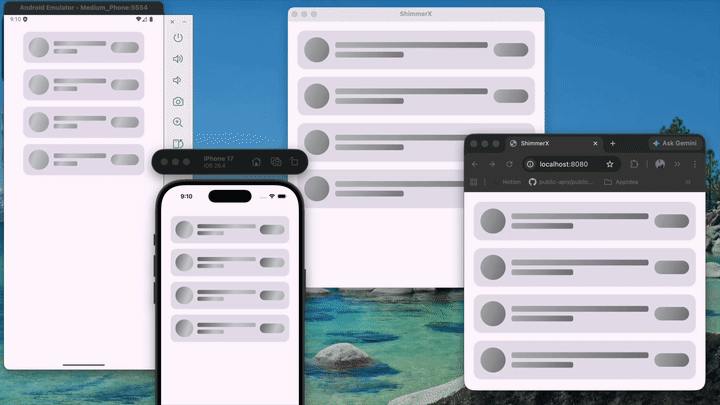
Smooth, theme-aware loading shimmer for Compose Multiplatform — one API across Android, iOS, Desktop, and Web.
Add the published library (replace the version if you use a different release):
Kotlin Multiplatform — in your shared source set, e.g. commonMain:
kotlin {
    sourceSets {
        commonMain.dependencies {
            implementation("io.github.maulikdadhaniya:shimmerx:<LATEST_VERSION>")
        }
    }
}
Android-only module:
dependencies {
    implementation("io.github.maulikdadhaniya:shimmerx:<LATEST_VERSION>")
}
Kotlin Multiplatform also publishes per-target Maven modules (e.g.
shimmerx-iosarm64). You still declare only the line above; Gradle picks the right artifact per platform.
Clone the repo and open it in Android Studio or IntelliJ. The library lives in the shimmerX module; composeApp is a demo app.
Place it inside MaterialTheme { } so shimmer matches your ColorScheme.
MaterialTheme {
    ShimmerAppTheme(
        appearance = ShimmerAppearance(
            light = ShimmerDefaults.Light,
            dark = ShimmerDefaults.Dark,
        ),
    ) {
        // Your content
    }
}
ShimmerDefaults.Light / Dark — gradient presets and timing.ShimmerAppearance — separate configs for light and dark UI.Typical pattern: background(placeholderColor, shape) then Modifier.shimmerx(shape = shape).
val base = MaterialTheme.colorScheme.surfaceContainerHigh

Box(
    Modifier
        .size(48.dp)
        .background(base, CircleShape)
        .shimmerx(shape = CircleShape),
)
Use a shape that matches the background (e.g. RoundedCornerShape(8.dp) for rounded rectangles).
Helpers for common skeletons:
ShimmerCircle(size = 52.dp, baseColor = base)
ShimmerBlock(
    modifier = Modifier.fillMaxWidth().height(12.dp),
    cornerRadius = 4.dp,
    baseColor = base,
)
ShimmerTextLines(lineCount = 3, baseColor = base, lastLineFraction = 0.6f)On Modifier.shimmerx:
themeOverride — custom ShimmerTheme (colors, duration, angle).colorVariant — ShimmerColorVariant.Default, Dark, Ocean, Sunset, Emerald.colors — explicit gradient stops.clip — clipping with your shape.ShimmerAppTheme shares one ShimmerState across placeholders. Use useProviderProgress = false on a modifier for an independent animation.
| Platform | Command |
|---|---|
| Android | ./gradlew :composeApp:assembleDebug |
| Desktop (JVM) | ./gradlew :composeApp:run |
| Web (Wasm) | ./gradlew :composeApp:wasmJsBrowserDevelopmentRun |
| Web (JS) | ./gradlew :composeApp:jsBrowserDevelopmentRun |
| iOS | Open iosApp in Xcode and run. |
Made by ❤️ Maulik Dadhaniya