
Offers a visually appealing, customizable liquid slider with fluid animations and image-switching capabilities, suitable for diverse applications requiring interactive UI elements.
This library was inspired by Ramotion's original library which i migrated to Jetpack Compose
Add this to your module's build.gradle file:
dependencies {
    ...
implementation("io.github.mejdi14:KMP-Liquid-Slider:1.0.7")}LiquidSlider(
modifier = Modifier.fillMaxWidth(),
size = LiquidSliderSize(width = 300.dp, height = 50.dp),
liquidSliderConfig = LiquidSliderConfig(
barColor = Color(0xFF6168E7),
bubbleColor = Color.White,
textColor = Color.Black,
startText = "0",
endText = "20",
textSize = 14f,
bubbleText = "Value",
initialPosition = 0.5f
),
onValueChange = { value ->
// Handle value change
},
onBeginTracking = {
// Called when the user starts interacting with the slider
},
onEndTracking = {
// Called when the user stops interacting with the slider
}
)The LiquidSliderConfig class allows you to customize the appearance and behavior of the liquid slider. Below is a table of its properties:
| Field | Type | Default Value | Description |
|---|---|---|---|
barColor |
Color |
Color(0xFF6168E7) |
The color of the slider bar. |
bubbleColor |
Color |
Color(0xFF6168E7) |
The color of the bubble (thumb). |
textColor |
Color |
Color.Black |
The color of the text displayed on the slider. |
barTextColor |
Color |
Color.White |
The color of the text inside the bar. |
startText |
String |
SliderConstants.TEXT_START |
The text displayed at the start of the slider. |
endText |
String |
SliderConstants.TEXT_END |
The text displayed at the end of the slider. |
textSize |
Float |
SliderConstants.TEXT_SIZE |
The size of the text displayed on the slider. |
bubbleText |
String? |
null |
Optional text displayed inside the bubble. |
progressCount |
Int |
SliderConstants.PROGRESS_COUNT |
The number of progress steps (if applicable). |
barCornerRadius |
Float |
SliderConstants.BAR_CORNER_RADIUS |
The corner radius of the slider bar. |
barVerticalOffset |
Float |
SliderConstants.BAR_VERTICAL_OFFSET |
The vertical offset of the slider bar. |
barInnerHorizontalOffset |
Float |
SliderConstants.BAR_INNER_HORIZONTAL_OFFSET |
The horizontal offset inside the slider bar. |
sliderWidth |
Float |
SliderConstants.SLIDER_WIDTH |
The width of the slider. |
sliderHeight |
Float |
SliderConstants.SLIDER_HEIGHT |
The height of the slider. |
topCircleDiameter |
Float |
SliderConstants.TOP_CIRCLE_DIAMETER |
The diameter of the top circle (bubble). |
bottomCircleDiameter |
Float |
SliderConstants.BOTTOM_CIRCLE_DIAMETER |
The diameter of the bottom circle. |
touchCircleDiameter |
Float |
SliderConstants.TOUCH_CIRCLE_DIAMETER |
The diameter of the touchable area. |
labelCircleDiameter |
Float |
SliderConstants.LABEL_CIRCLE_DIAMETER |
The diameter of the label circle. |
animationDuration |
Int |
SliderConstants.ANIMATION_DURATION |
The duration of animations in milliseconds. |
topSpreadFactor |
Float |
SliderConstants.TOP_SPREAD_FACTOR |
The spread factor for the top circle animation. |
bottomStartSpreadFactor |
Float |
SliderConstants.BOTTOM_START_SPREAD_FACTOR |
The spread factor for the bottom circle at the start. |
bottomEndSpreadFactor |
Float |
SliderConstants.BOTTOM_END_SPREAD_FACTOR |
The spread factor for the bottom circle at the end. |
liquidBalHandlerFactor |
Float |
SliderConstants.LIQUID_BALL_HANDLER_FACTOR |
The handler factor for the liquid ball animation. |
liquidBalMaxDistance |
Float |
SliderConstants.LIQUID_BALL_MAX_DISTANCE |
The maximum distance for the liquid ball animation. |
liquidBalRiseDistance |
Float |
SliderConstants.LIQUID_BALL_RISE_DISTANCE |
The rise distance for the liquid ball animation. |
textOffset |
Float |
SliderConstants.TEXT_OFFSET |
The offset for the text displayed on the slider. |
initialPosition |
Float |
SliderConstants.INITIAL_POSITION |
The initial position of the slider (between 0 and 1). |
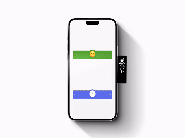
you can make the slider switch between different images just by providing a list of images

               val myImages = listOf<ImageBitmap>(
                    imageResource(Res.drawable.cold_sweat),
                    imageResource(Res.drawable.disappointed_relieved),
                    imageResource(Res.drawable.neutral_face),
                    imageResource(Res.drawable.blush),
                    imageResource(Res.drawable.heart_eyes),

                    )
                LiquidSlider(
                    modifier = Modifier.align(Alignment.Center),
                    liquidSliderConfig = LiquidSliderConfig(
                        imageList = myImages,
                    ),
                    onValueChange = { newValue ->
                    },
                )
If you have suggestions or feature requests, feel free to open an issue or contribute to the repository.
Contributions, issues, and feature requests are welcome!
Feel free to check the issues page if you want to contribute.
👤 Mejdi Hafiane
Please ⭐️ this repository if this project helped you!
Copyright © 2023 Mejdi Hafiane.
This project is MIT licensed.
This README provides a clear and structured overview of your KMP-Liquid-Slider library, making it easy for users to understand and integrate into their projects.
This library was inspired by Ramotion's original library which i migrated to Jetpack Compose
Add this to your module's build.gradle file:
dependencies {
    ...
implementation("io.github.mejdi14:KMP-Liquid-Slider:1.0.7")}LiquidSlider(
modifier = Modifier.fillMaxWidth(),
size = LiquidSliderSize(width = 300.dp, height = 50.dp),
liquidSliderConfig = LiquidSliderConfig(
barColor = Color(0xFF6168E7),
bubbleColor = Color.White,
textColor = Color.Black,
startText = "0",
endText = "20",
textSize = 14f,
bubbleText = "Value",
initialPosition = 0.5f
),
onValueChange = { value ->
// Handle value change
},
onBeginTracking = {
// Called when the user starts interacting with the slider
},
onEndTracking = {
// Called when the user stops interacting with the slider
}
)The LiquidSliderConfig class allows you to customize the appearance and behavior of the liquid slider. Below is a table of its properties:
| Field | Type | Default Value | Description |
|---|---|---|---|
barColor |
Color |
Color(0xFF6168E7) |
The color of the slider bar. |
bubbleColor |
Color |
Color(0xFF6168E7) |
The color of the bubble (thumb). |
textColor |
Color |
Color.Black |
The color of the text displayed on the slider. |
barTextColor |
Color |
Color.White |
The color of the text inside the bar. |
startText |
String |
SliderConstants.TEXT_START |
The text displayed at the start of the slider. |
endText |
String |
SliderConstants.TEXT_END |
The text displayed at the end of the slider. |
textSize |
Float |
SliderConstants.TEXT_SIZE |
The size of the text displayed on the slider. |
bubbleText |
String? |
null |
Optional text displayed inside the bubble. |
progressCount |
Int |
SliderConstants.PROGRESS_COUNT |
The number of progress steps (if applicable). |
barCornerRadius |
Float |
SliderConstants.BAR_CORNER_RADIUS |
The corner radius of the slider bar. |
barVerticalOffset |
Float |
SliderConstants.BAR_VERTICAL_OFFSET |
The vertical offset of the slider bar. |
barInnerHorizontalOffset |
Float |
SliderConstants.BAR_INNER_HORIZONTAL_OFFSET |
The horizontal offset inside the slider bar. |
sliderWidth |
Float |
SliderConstants.SLIDER_WIDTH |
The width of the slider. |
sliderHeight |
Float |
SliderConstants.SLIDER_HEIGHT |
The height of the slider. |
topCircleDiameter |
Float |
SliderConstants.TOP_CIRCLE_DIAMETER |
The diameter of the top circle (bubble). |
bottomCircleDiameter |
Float |
SliderConstants.BOTTOM_CIRCLE_DIAMETER |
The diameter of the bottom circle. |
touchCircleDiameter |
Float |
SliderConstants.TOUCH_CIRCLE_DIAMETER |
The diameter of the touchable area. |
labelCircleDiameter |
Float |
SliderConstants.LABEL_CIRCLE_DIAMETER |
The diameter of the label circle. |
animationDuration |
Int |
SliderConstants.ANIMATION_DURATION |
The duration of animations in milliseconds. |
topSpreadFactor |
Float |
SliderConstants.TOP_SPREAD_FACTOR |
The spread factor for the top circle animation. |
bottomStartSpreadFactor |
Float |
SliderConstants.BOTTOM_START_SPREAD_FACTOR |
The spread factor for the bottom circle at the start. |
bottomEndSpreadFactor |
Float |
SliderConstants.BOTTOM_END_SPREAD_FACTOR |
The spread factor for the bottom circle at the end. |
liquidBalHandlerFactor |
Float |
SliderConstants.LIQUID_BALL_HANDLER_FACTOR |
The handler factor for the liquid ball animation. |
liquidBalMaxDistance |
Float |
SliderConstants.LIQUID_BALL_MAX_DISTANCE |
The maximum distance for the liquid ball animation. |
liquidBalRiseDistance |
Float |
SliderConstants.LIQUID_BALL_RISE_DISTANCE |
The rise distance for the liquid ball animation. |
textOffset |
Float |
SliderConstants.TEXT_OFFSET |
The offset for the text displayed on the slider. |
initialPosition |
Float |
SliderConstants.INITIAL_POSITION |
The initial position of the slider (between 0 and 1). |
you can make the slider switch between different images just by providing a list of images
               val myImages = listOf<ImageBitmap>(
                    imageResource(Res.drawable.cold_sweat),
                    imageResource(Res.drawable.disappointed_relieved),
                    imageResource(Res.drawable.neutral_face),
                    imageResource(Res.drawable.blush),
                    imageResource(Res.drawable.heart_eyes),

                    )
                LiquidSlider(
                    modifier = Modifier.align(Alignment.Center),
                    liquidSliderConfig = LiquidSliderConfig(
                        imageList = myImages,
                    ),
                    onValueChange = { newValue ->
                    },
                )
If you have suggestions or feature requests, feel free to open an issue or contribute to the repository.
Contributions, issues, and feature requests are welcome!
Feel free to check the issues page if you want to contribute.
👤 Mejdi Hafiane
Please ⭐️ this repository if this project helped you!
Copyright © 2023 Mejdi Hafiane.
This project is MIT licensed.
This README provides a clear and structured overview of your KMP-Liquid-Slider library, making it easy for users to understand and integrate into their projects.