
High-energy UI component library offering 27 neon-styled components, kinetic interactions, bold typography, and a Kinetic Pulse design system with glow accents, squircle shapes, and charts.

A high-energy Compose Multiplatform UI component library.
Bold typography. Kinetic interactions. Neon-saturated design system.
A few sample screens from Pop* components — each rendered in light and dark themes. Explore more here.
| Sample | Light | Dark |
|---|---|---|
|
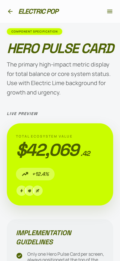
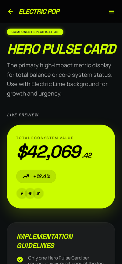
Hero Pulse Card Composite banner card with pulse accent. |
 |
 |
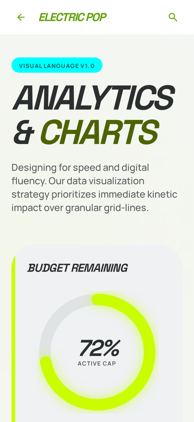
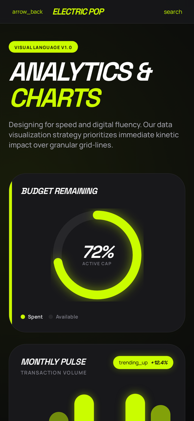
Analytics ChartsPopChart in line, bar, and donut variants.
|
 |
 |
|
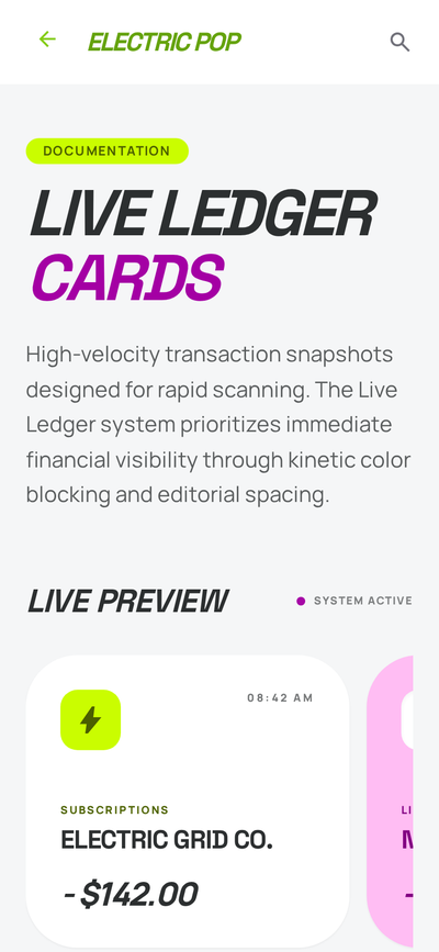
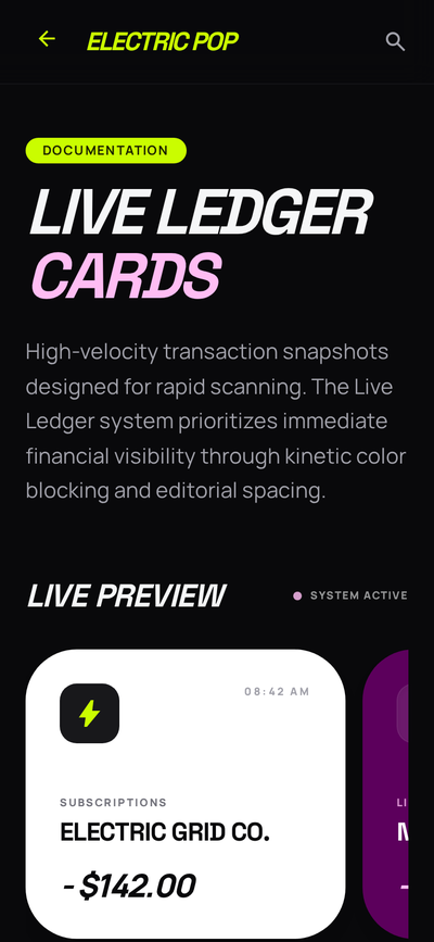
Live Ledger Cards Data rows, badges, and pills composed into a feed. |
 |
 |
// build.gradle.kts
dependencies {
    implementation("co.tanay:compose-electric-pop:0.0.1")
}ElectricPopTheme {
PopButton(onClick = { /* … */ }) {
Text("Get Started")
}
}Building with an AI assistant? Install the Electric Pop Agent Skill so it generates UI that follows the design system instead of generic Material:
npx skills add tanaykumarbera/compose-electric-popThis installs a portable Agent Skill into your coding agent — Claude
Code, Cursor, GitHub Copilot, Codex, Gemini CLI, and others. The agent then knows how to add
the dependency, set up ElectricPopTheme, pick the right Pop* component, and honor the 7
design rules. Its component cheat-sheet is generated from source, so it stays in sync with the
published API docs. Source: skills/electric-pop/SKILL.md.
Electric Pop ships with an opinionated default theme but supports full customization:
ElectricPopTheme(
    darkTheme = true,
    colorScheme = yourCustomColorScheme,
    typography = yourCustomTypography,
) {
    // Your UI — all Pop components automatically use your theme
}The library ships 27 components across three tiers:
co.tanay.electricpop.foundation) — buttons, fields, chips, surfaces, icons, typography primitives.co.tanay.electricpop.composite) — banner cards, dashboard cards, action cards, carousels.co.tanay.electricpop.chart) — PopChart with PopChartStyle.Line, Bar, Donut.For the full component reference — API, parameters, and inline light + dark screenshots — see the published Dokka site:
📖 https://tanaykumarbera.github.io/compose-electric-pop/api/
Electric Pop is built on the "Kinetic Pulse" design language: tonal hierarchy instead of borders, glow instead of grey shadow, type as object. The 7 design rules every component enforces — plus the full theme architecture, color palette, typography, shape, and spacing token tables — are documented in DESIGN.md.
Highlights:
#CAFD00), Neon Magenta (#FFBDF3), Cyber Cyan (#00FFFF)Apache License 2.0
A high-energy Compose Multiplatform UI component library.
Bold typography. Kinetic interactions. Neon-saturated design system.
A few sample screens from Pop* components — each rendered in light and dark themes. Explore more here.
| Sample | Light | Dark |
|---|---|---|
|
Hero Pulse Card Composite banner card with pulse accent. |
|
|
Analytics ChartsPopChart in line, bar, and donut variants.
|
|
|
|
Live Ledger Cards Data rows, badges, and pills composed into a feed. |
|
|
// build.gradle.kts
dependencies {
    implementation("co.tanay:compose-electric-pop:0.0.1")
}ElectricPopTheme {
PopButton(onClick = { /* … */ }) {
Text("Get Started")
}
}Building with an AI assistant? Install the Electric Pop Agent Skill so it generates UI that follows the design system instead of generic Material:
npx skills add tanaykumarbera/compose-electric-popThis installs a portable Agent Skill into your coding agent — Claude
Code, Cursor, GitHub Copilot, Codex, Gemini CLI, and others. The agent then knows how to add
the dependency, set up ElectricPopTheme, pick the right Pop* component, and honor the 7
design rules. Its component cheat-sheet is generated from source, so it stays in sync with the
published API docs. Source: skills/electric-pop/SKILL.md.
Electric Pop ships with an opinionated default theme but supports full customization:
ElectricPopTheme(
    darkTheme = true,
    colorScheme = yourCustomColorScheme,
    typography = yourCustomTypography,
) {
    // Your UI — all Pop components automatically use your theme
}The library ships 27 components across three tiers:
co.tanay.electricpop.foundation) — buttons, fields, chips, surfaces, icons, typography primitives.co.tanay.electricpop.composite) — banner cards, dashboard cards, action cards, carousels.co.tanay.electricpop.chart) — PopChart with PopChartStyle.Line, Bar, Donut.For the full component reference — API, parameters, and inline light + dark screenshots — see the published Dokka site:
📖 https://tanaykumarbera.github.io/compose-electric-pop/api/
Electric Pop is built on the "Kinetic Pulse" design language: tonal hierarchy instead of borders, glow instead of grey shadow, type as object. The 7 design rules every component enforces — plus the full theme architecture, color palette, typography, shape, and spacing token tables — are documented in DESIGN.md.
Highlights:
#CAFD00), Neon Magenta (#FFBDF3), Cyber Cyan (#00FFFF)Apache License 2.0