
Compose UI library creates icon buttons or wraps views with bouncy and spark animations, enhancing interactivity and visual appeal. Offers customizable styles and effects.
is a Compose Multiplatform UI Library to create icon button or wrap compose view to have bouncy and spark animation.
Add in build.gradle.kts
implementation("id.wendei:sparkify:1.0.0")
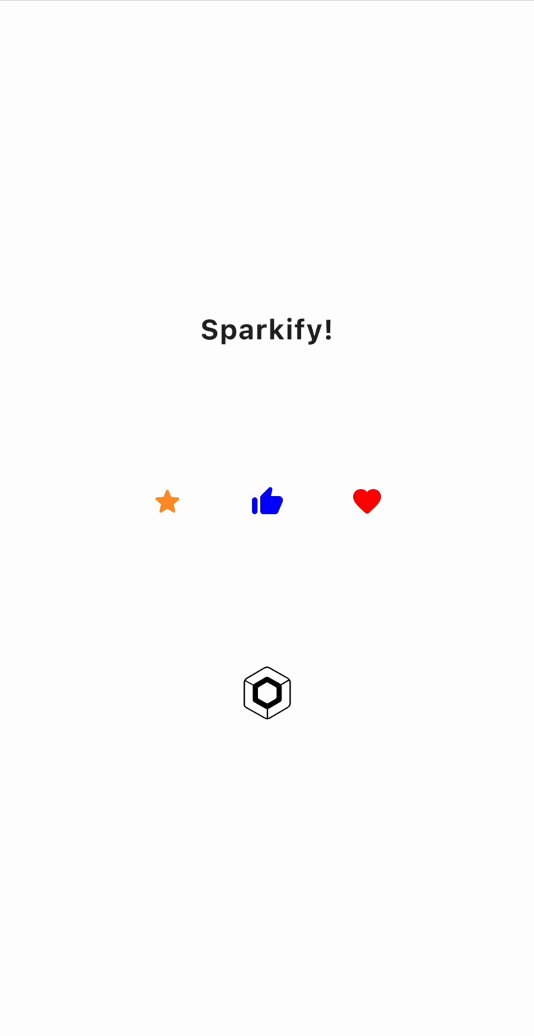
@Composable
private fun SparkifyExample() {
    Box(
        modifier = Modifier
            .fillMaxSize(),
        contentAlignment = Alignment.Center
    ) {
        Column(
            verticalArrangement = Arrangement.spacedBy(100.dp),
            horizontalAlignment = Alignment.CenterHorizontally
        ) {
            Sparkify(
                style = SparkifyDefault.sparkStyle(
                    sparkSize = 10f,
                    smallDotColor = Color.Red.copy(alpha = 0.8f),
                    bigDotColor = Color.Red
                ),
                onClick = {

                },
                content = {
                    Text(
                        text = "Sparkify!",
                        fontWeight = FontWeight.Bold,
                        fontSize = 20.sp
                    )
                }
            )
            Row(
                horizontalArrangement = Arrangement.spacedBy(48.dp)
            ) {
                SparkifyIconButton(
                    imageVector = Icons.Rounded.Star,
                    tint = Color(0xFFFF9529),
                    style = SparkifyDefault.sparkStyle(
                        smallDotColor = Color(0xFFFF9529),
                        bigDotColor = Color(0xFFFF9529)
                    ),
                    onClick = {

                    }
                )
                SparkifyIconButton(
                    imageVector = Icons.Rounded.ThumbUp,
                    tint = Color.Blue,
                    style = SparkifyDefault.sparkStyle(
                        smallDotColor = Color.Blue,
                        bigDotColor = Color.Blue
                    ),
                    onClick = {

                    }
                )
                SparkifyIconButton(
                    imageVector = Icons.Rounded.Favorite,
                    tint = Color.Red,
                    style = SparkifyDefault.sparkStyle(
                        smallDotColor = Color.Red,
                        bigDotColor = Color.Red
                    ),
                    onClick = {

                    }
                )
            }
            SparkifyIconButton(
                modifier = Modifier
                    .size(48.dp),
                style = SparkifyDefault.sparkStyle(
                    sparkSize = 10f,
                    smallDotColor = Color.Magenta.copy(alpha = 0.5f),
                    bigDotColor = Color.Magenta.copy(alpha = 0.8f)
                ),
                painter = painterResource(Res.drawable.compose_multiplatform),
                onClick = {

                }
            )
        }
    }
}
Licensed under the Apache License, Version 2.0 (the "License");
you may not use this file except in compliance with the License.
You may obtain a copy of the License at

  http://www.apache.org/licenses/LICENSE-2.0

Unless required by applicable law or agreed to in writing, software
distributed under the License is distributed on an "AS IS" BASIS,
WITHOUT WARRANTIES OR CONDITIONS OF ANY KIND, either express or implied.
See the License for the specific language governing permissions and
limitations under the License.
is a Compose Multiplatform UI Library to create icon button or wrap compose view to have bouncy and spark animation.
Add in build.gradle.kts
implementation("id.wendei:sparkify:1.0.0")
@Composable
private fun SparkifyExample() {
    Box(
        modifier = Modifier
            .fillMaxSize(),
        contentAlignment = Alignment.Center
    ) {
        Column(
            verticalArrangement = Arrangement.spacedBy(100.dp),
            horizontalAlignment = Alignment.CenterHorizontally
        ) {
            Sparkify(
                style = SparkifyDefault.sparkStyle(
                    sparkSize = 10f,
                    smallDotColor = Color.Red.copy(alpha = 0.8f),
                    bigDotColor = Color.Red
                ),
                onClick = {

                },
                content = {
                    Text(
                        text = "Sparkify!",
                        fontWeight = FontWeight.Bold,
                        fontSize = 20.sp
                    )
                }
            )
            Row(
                horizontalArrangement = Arrangement.spacedBy(48.dp)
            ) {
                SparkifyIconButton(
                    imageVector = Icons.Rounded.Star,
                    tint = Color(0xFFFF9529),
                    style = SparkifyDefault.sparkStyle(
                        smallDotColor = Color(0xFFFF9529),
                        bigDotColor = Color(0xFFFF9529)
                    ),
                    onClick = {

                    }
                )
                SparkifyIconButton(
                    imageVector = Icons.Rounded.ThumbUp,
                    tint = Color.Blue,
                    style = SparkifyDefault.sparkStyle(
                        smallDotColor = Color.Blue,
                        bigDotColor = Color.Blue
                    ),
                    onClick = {

                    }
                )
                SparkifyIconButton(
                    imageVector = Icons.Rounded.Favorite,
                    tint = Color.Red,
                    style = SparkifyDefault.sparkStyle(
                        smallDotColor = Color.Red,
                        bigDotColor = Color.Red
                    ),
                    onClick = {

                    }
                )
            }
            SparkifyIconButton(
                modifier = Modifier
                    .size(48.dp),
                style = SparkifyDefault.sparkStyle(
                    sparkSize = 10f,
                    smallDotColor = Color.Magenta.copy(alpha = 0.5f),
                    bigDotColor = Color.Magenta.copy(alpha = 0.8f)
                ),
                painter = painterResource(Res.drawable.compose_multiplatform),
                onClick = {

                }
            )
        }
    }
}
Licensed under the Apache License, Version 2.0 (the "License");
you may not use this file except in compliance with the License.
You may obtain a copy of the License at

  http://www.apache.org/licenses/LICENSE-2.0

Unless required by applicable law or agreed to in writing, software
distributed under the License is distributed on an "AS IS" BASIS,
WITHOUT WARRANTIES OR CONDITIONS OF ANY KIND, either express or implied.
See the License for the specific language governing permissions and
limitations under the License.